

I saw this infographic a few weeks ago on Co.Design and it blew my mind.
Why I didn’t post it then – I can’t tell you. Other than the fact that I was perhaps a bit too crazed preparing for our eTail West event, which just wrapped last week.
But I didn’t forget about it – and that’s what matters.
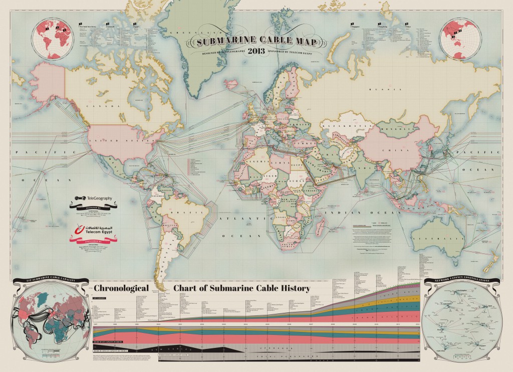
This graphic explores the underwater cables that power the Internet in a vintage map kind of way, which makes it both interesting to look at and super hip. Have you ever wondered how you get your Internet? Well, turns out that more than a half a million miles of cables, which are little more than two inches thick, line the ocean floor around the world and transmit terabytes of data across the globe every second. According to the Co.Design article, as of 2006, satellites represented only 1 percent of telecommunications traffic, underwater pipes account for the majority of our info flow.
TeleGeography, a telecom research firm, produced this Submarine Cable Map and I think it’s super awesome.
Check out the below graphic to see which countries are sucking down the most data (who’d have thought it’d be the good old US of A?) A timeline in the middle walks us through growing line capacity compared to use (we’ve had to double capacity in the last few years to keep ~80 percent of the lines free).
Take a look at it for yourself – be amazed (click to see it bigger – you’ll want to explore…and don’t forget to scroll to the bottom for the chronological history chart):


Recent Comments