If there is at least one bracket going around your office right now, effectively distracting you and your coworkers with the irresistible temptation to track your own success, well, join the club.
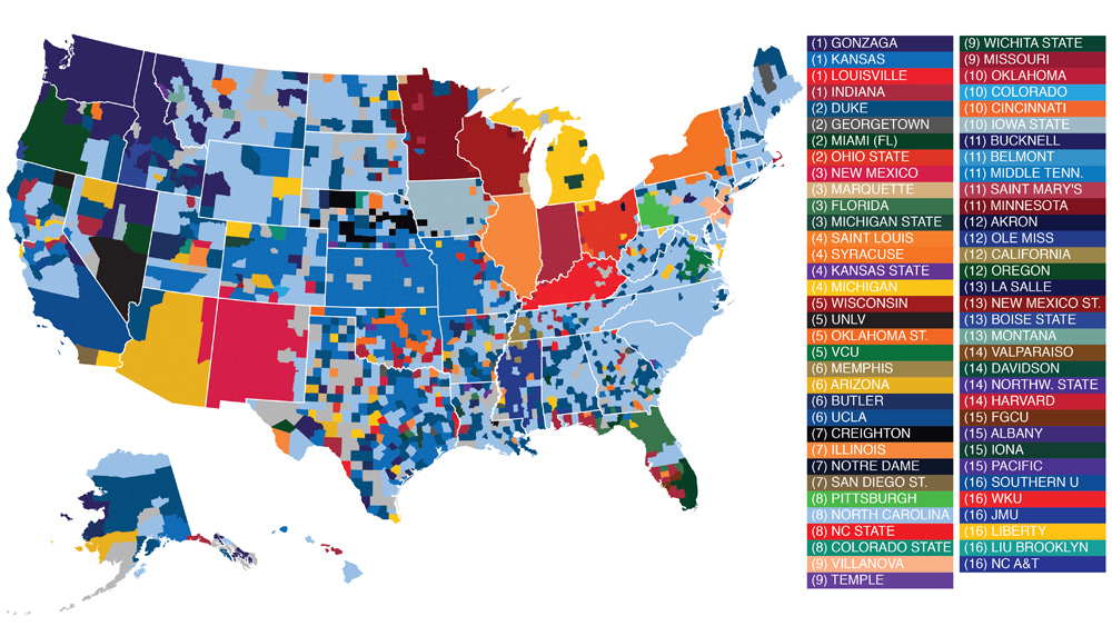
March Madness has arrived and just when we thought there was no real reason to post about it other than the fact that we’re surely thinking about it too much, Facebook went and made an infographic based on teams that its users “liked” most. How very clever of you, Facebook data scientists.
Check out the graphic below to see things like:
– in the Midwest, fans are neatly partitioned by state lines whereas in the South, favorite teams are more haphazardly organized
– 17 school’s in this year’s bracket weren’t best loved by anyone
See where the fans live and think about what it might mean for your online retail strategies in the coming weeks leading up to the final four. (Click to enlarge)


Recent Comments