With all the infographics out there it’s easy to get a little graphically fatigued, and naturally, to miss things that aren’t well-highlighted in said graphics. Few of you are probably stopping to think about what actually makes one graphic better than another. Or are you?
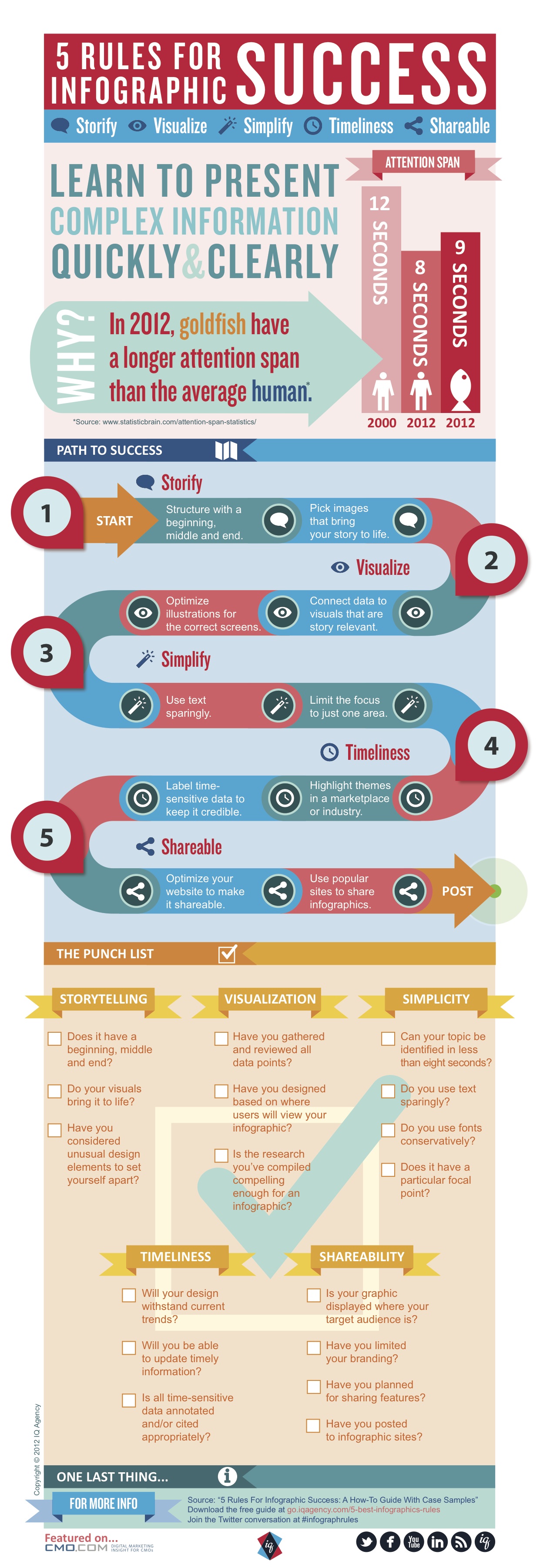
This graphic, brought to us by the IQ Agency, gives some insights into what makes an infographic worth one’s perusal. Graphically, it’s not as good as some graphics we’ve seen, but perhaps its because the info in this graphic lends itself more to perhaps, a blog post. What a conundrum. Here is what we saw:
– Statisticbrain.com says that in 2012, goldfish, clocking in at 9 seconds, have a longer attention span than humans who are averaging 8 seconds. What?! That. Is. Disturbing. (But also why infographics kind of rule with the modern day average Joe.)
– Infographics should tell a story. When we say story, we mean it in the most classic way: beginning, middle, end.
– Use text sparingly – unlike this particular graphic which actually relies on quite a bit of text.
– Make it timely. Big surprise to a trained journalist (that’s sarcasm): Timeliness matters. Highlight what’s relevant not yesterday but NOW.
– Create a checklist and make sure your graphic meets all those points before you blast it all crazy on the web.
– Go Social with it and share your graphic everywhere that matters.
Here’s the graphic (though we’ve pretty much summed up the important matters already – no matter – have a look!)


Recent Comments