The way that people use the web to shop has changed dramatically since our trusted friend eBay came around, back in 1995. (Can you even believe it’s been almost 20 years?! Feeling old…)
Needless to say, it was time for eBay’s same old model to change.
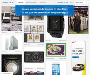
About a year ago, eBay set out on a major redesign path, and as a social media lover and fan of Pinterest, I’m happy to say that its new site looks just like…Pinterest! Ok, maybe not JUST like Pinterest, but its new “Feed” certainly borrows from the social media trailblazer. And why shouldn’t it? Modern day consumers love Pinterest because it makes us feel like we’re exploring a product, not exploring the description some corporation or seller wrote about a product…or hopelessly glaring at low quality images that a seller prays will compel us to buy said product.
To utilize this Pinterest-style Feed, users put in a few key terms, like “chaise lounges” or “Dallmore scotch,” and eBay will generate a custom, interest-centric board of images to explore. Adding, deleting, and customizing these items is easy and users can preview how new search terms will look. The Feed is what you will see every time you go to eBay after you’ve set it up to your liking.
Of course, the inherent benefit and challenge of this model is that all photos should be awesome and beautiful, and as this author wonders, will that always be the case on eBay?
What do you think about eBay’s new design?


Recent Comments