

Have any of you noticed what’s new with Gmail? If you’re an avid user, it’s impossible not to.
 At first, the new layout threw me for a loop, and like most change that is forced and not asked for, I hated it. And now I kind of love it.
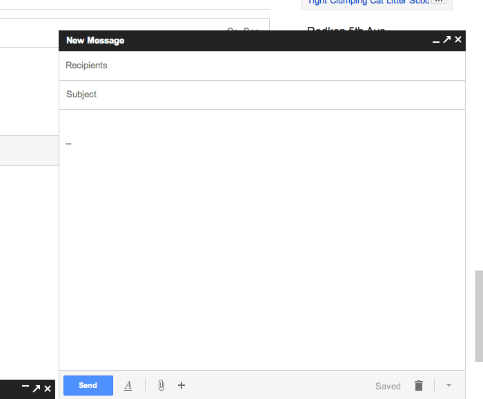
The bottom right corner of the screen, formally housing all your little elicit Gchat windows, is now also home to the new message window. That means that when you go to compose a new message, instead of a message window opening up and overtaking your Gmail home screen, a smaller, Gchat style window (but bigger than that) pops up so that you can continue doing all your other stuff in Gmail while composing your message. Very good feature for multi-taskers like myself.
What I didn’t love about the new style was the clarity with which Google decided to display its email options – things like CC: BCC: and Edit Subject – when opening a reply window. In a newly composed message, they’re pretty clear. But when replying to a message and wanting to CC: or change subject lines, a not-so-savvy email user wouldn’t necessarily know that these fields are hidden in there and only appear if asked to.
Jason Cornwell, Gmail’s lead designer, explained that one goal behind the new design is to “give you permission to write shorter messages.”
“We wanted the new compose to facilitate these quicker messages,” he said to Kyle VanHemert in his article in Co.Design. “Or at least make it a space where that felt appropriate.”
With digital messaging getting shorter and shorter across mediums (think SMS, Twitter, Facebook, etc.), it’s no wonder that Gmail decided it was time to design an interface that was more in line with such a model. The UX of the new format is rather pleasant once it’s been tinkered with and you’re used to its functionality (which really doesn’t take much.) 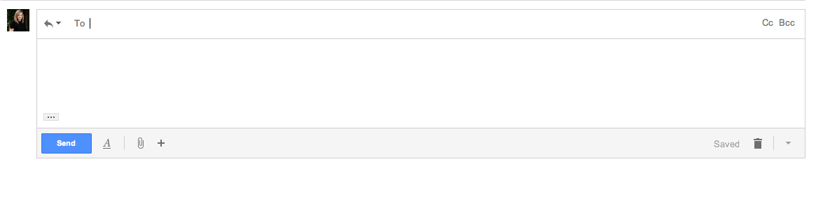
One glitch I will note, though, is that when navigating fields using the TAB key, your signature gets auto-highlighted, which is annoying since you want to start typing right after you’ve navigated to the body field and if you do, it’ll delete whatever signature you have automatically loaded there. Go ahead, try it. Tell me if it happens to you!


Recent Comments